cs106a – Assignment #7 – Task #2

The complete specification of assignment #7 can be found as part of the stream at iTunes.

Implement the FacePamphletProfile class

The FacePamphletProfile class encapsulates the information pertaining to one profile in the social network. That information consists of four parts:

  1. The name of the person with this profile, such as “Mehran Sahami” or “Julie Zelenski”
  2. The status associated with this profile. This is just a String indicating what the person associated with the profile is currently doing. Until it is explicitly set, the status should initially be the empty string.
  3. The image associated with that profile. This is a GImage. Until it is explicitly set, this field should initially be null since we don’t initially have an image associated with a profile.
  4. The list of friends of this profile. The list of friends is simply a list of the names (i.e., list of Strings) that are friends with this profile. This list starts empty. The data structure you use to keep track of this list is left up to you.

The last method in the starter implementation of FacePamphletProfile is a toString method whose role is to return a human-readable representation of the data stored in the profile. The general form of the string returned by this method is: Continue reading “cs106a – Assignment #7 – Task #2”
FacebooktwitterredditpinterestlinkedintumblrmailFacebooktwitterredditpinterestlinkedintumblrmail

cs106a – Assignment #7 – Task #1

The complete specification of assignment #7 can be found as part of the stream at iTunes.

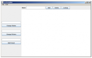
Assemble the GUI interactors

As seen in the initial start-up screen of the application (shown below), there are a number of interactors (JLabels, JTextFields, and JButtons) in both the NORTH and WEST border regions of the application.

cs106a – assignment #7 – task #1
Continue reading “cs106a – Assignment #7 – Task #1”

FacebooktwitterredditpinterestlinkedintumblrmailFacebooktwitterredditpinterestlinkedintumblrmail

cs106a – Assignment #6 – Extra Task #4

The complete specification of assignment #6 can be found as part of the stream at iTunes.

Adjust the font size as the application size changes

One of the wonderful features of this program is that it redraws itself to fill the available space if you change the size of the window. If you make it too small, however, the labels run together and become unreadable. You could eliminate this problem by choosing a font size that allows each label to fit in the space available.

Check if the label is wider than the column, if so adjust the font size:

	private void adjustSizeOfLabel(GLabel label) {
		double dx = getWidth() * 0.85 / NDECADES;
		double labelWidth = label.getWidth();
		if (labelWidth > dx) {
			Font font = label.getFont();
			label.setFont(font.deriveFont((float) (dx * font.getSize() / labelWidth)));
		}		
	}

	private void drawLabel(NameSurferEntry entry, int index, double x, double y) {
		...
		adjustSizeOfLabel(label);
		...
	}

	private void drawGrid() {
			...
			GLabel label = new GLabel(" " + year, x, yText);
			adjustSizeOfLabel(label);
			add(label);
			...
	}

The code for this assignment is available on github.

FacebooktwitterredditpinterestlinkedintumblrmailFacebooktwitterredditpinterestlinkedintumblrmail

cs106a – Assignment #6 – Extra Task #3

The complete specification of assignment #6 can be found as part of the stream at iTunes.

Try to minimize the overprinting problem

If the popularity of a name is improving slowly, the graph for that name will cross the label for that point making it harder to read. You could reduce this problem by positioning the label more intelligently. If a name were increasing in popularity, you could display the label below the point; conversely, for names that are falling in popularity, you could place the label above the point. An even more challenging task is to try to reduce the problem of having labels for different names collide, as they do for Sam and Samantha.

For the first task – moving the label below the graph if is ascending – the label drawing class needs more information about the graph thus it is better to provide the complete entry instead of the name and rank only:
Continue reading “cs106a – Assignment #6 – Extra Task #3”

FacebooktwitterredditpinterestlinkedintumblrmailFacebooktwitterredditpinterestlinkedintumblrmail

cs106a – Assignment #6 – Extra Task #2

The complete specification of assignment #6 can be found as part of the stream at iTunes.

Allow deletion as well as addition

Because the screen quickly becomes cluttered as you graph lots of names, it would be convenient if there were some way to delete entries individually, as opposed to clearing the entire display and then adding back the ones you wanted. The obvious strategy would be to add a Delete button that eliminated the entry corresponding to the value in the Name box. That approach, however, has a minor drawback given the design so far. If you added a bunch of entries to the graph and then deleted the early ones, the colors of the later entries would shift, which might prove disconcerting. Can you redesign the color-selection strategy so that displayed entries retain their color even if other entries are removed?

Add the delete button to the main class:
Continue reading “cs106a – Assignment #6 – Extra Task #2”

FacebooktwitterredditpinterestlinkedintumblrmailFacebooktwitterredditpinterestlinkedintumblrmail

cs106a – Assignment #6 – Extra Task #1

The complete specification of assignment #6 can be found as part of the stream at iTunes.

Add features to the display

The current display contains only lines and labels, but could easily be extended to make it more readable. You could, for example, put a dot at each of the data points on the graph. Even better, however, would be to choose different symbols for each line so that the data would be easily distinguishable even in a black-and-white copy. For example, you could use little circles for the first entry, squares for the second, triangles for the third, diamonds for the fourth, and so on. You might also figure out what the top rank for a name is over the years and set the label for that data point in boldface.

Create a new data type to hold the possible forms of the markers:
Continue reading “cs106a – Assignment #6 – Extra Task #1”

FacebooktwitterredditpinterestlinkedintumblrmailFacebooktwitterredditpinterestlinkedintumblrmail

cs106a – Assignment #6 – Task #5

The complete specification of assignment #6 can be found as part of the stream at iTunes.

Complete the implementation of NameSurferGraph class

In addition to creating the background grid, the update method in NameSurferGraph also has to plot the actual data values. The NameSurferGraph class includes two methods for specifying what entries are displayed on the screen. The addEntry method adds a new NameSurferEntry to a list of values that are currently on the display. The clear method deletes all of the entries in that list so as to clear the graph.
There are a couple of points that you should keep in mind while implementing this part of the program:

  • To make the data easier to read, the lines on the graph are shown in different colors. In the sample applet on the web site, the first data entry is plotted in black, the second in red, the third in blue, and the fourth in magenta. After that, the colors cycle around again through the same sequence.
  • The fact that rank 1 is at the top of the window and rank 1000 is at the bottom means that it can sometimes seem confusing that rank 0—which means that the name does not appear in the top 1000 values for that year—appears at the bottom. To reduce the apparent discontinuity between rank 1 and rank 0, the entries for names that are absent from the data for a decade are listed with an asterisk instead of a numeric rank.

Continue reading “cs106a – Assignment #6 – Task #5”

FacebooktwitterredditpinterestlinkedintumblrmailFacebooktwitterredditpinterestlinkedintumblrmail