Please note, this blog entry is from a previous course. You might want to check out the current one.
Change the image on the back of the cards (i.e. something other than a Stanford logo). Also, set the application and launch image icons for Matchismo. Try to get the resolutions right for each application icon and launch image. Let your creativity run wild when it comes to designing an icon!
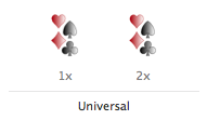
Using your favorite graphic program, create two new images for the front and the back of the card, and export each of them in two formats 40×60 and 80×120. Visit your image assets and drag in the new images:
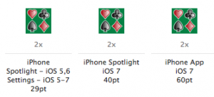
For your app icon you need three different sizes 2*29pt = 58×58, 2*40pt = 80×80 and 2*60pt = 120×120. Like before drag them into your image assets:
For the launch images open the app in the iPhone simulator, once in the 3.5-inch and once in the 4-inch version and take screen shots (cmd-s). The launch images should be identical to the first screen of the app, except for text and elements that might change. Therefore open the screen shots and remove all texts and changing elements. For matchismo the texts for the score label, the deal button, the mode selector and all of the the status bar on top:
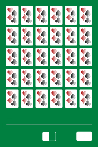
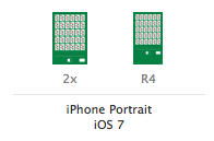
Now you should have two launch images sized 640×960 and 640×1136 which you can drag into your image assets:
The complete code is available on github.
lol lazy on the launch images. what happened to let your creativity run wild 😉